In Conversation with Zazou Roddam
Words by
Violet Conroy

My dad was a filmmaker and my mum was very creative, so film and TV were a big part of my world growing up. It’s what we’d talk about most. I remember being completely drawn to movies and photography from a really young age. That early exposure definitely shaped the way I see things, and eventually led me to study photography at ICP for two years in New York.
While studying photography, I had the opportunity to learn from some really great professors, including Clifford Owens and Allen Frame. They really expanded my understanding of art and helped me explore the intersection between fine art and photography. I was being introduced to practices I hadn’t encountered before through artists like Martha Rosler, Gordon Matta-Clark, and especially Joan Jonas, who had a big impact on me. Over time, my work evolved quite naturally into sculpture, but photography is still very much part of my practice. I just engage with it in a different way now.
_Ref-1361.jpeg)
Yes, I actually still have the video montages I made as a child. When I was around ten or eleven years old, my dad gave me a camcorder, and I spent about a week filming whatever I could see from my bedroom window. I edited the footage on my mum’s new computer, mostly zoomed-in shots of people walking on the zebra crossing outside our apartment, with fast-forwarded clips and lots of close crops. Funnily enough, when I revisited it recently, I realised that some of those stylistic choices have stuck with me. Even now, my editing style tends to lean towards tight framing, zoom-ins, and isolating particular moments.
Moving to New York completely rewired the way I think about cities and public spaces. Being immersed in the city made me curious about how people interact with their environment, which led me to start reading books about the history of New York. From there, I became interested in architectural theory and the choreography between people, space, and time, and how architecture can reflect authority, control, and identity. I also had the chance to do some work experience with Jill Magid, which was a dream come true. Her film, Evidence Locker (2004), changed my life.
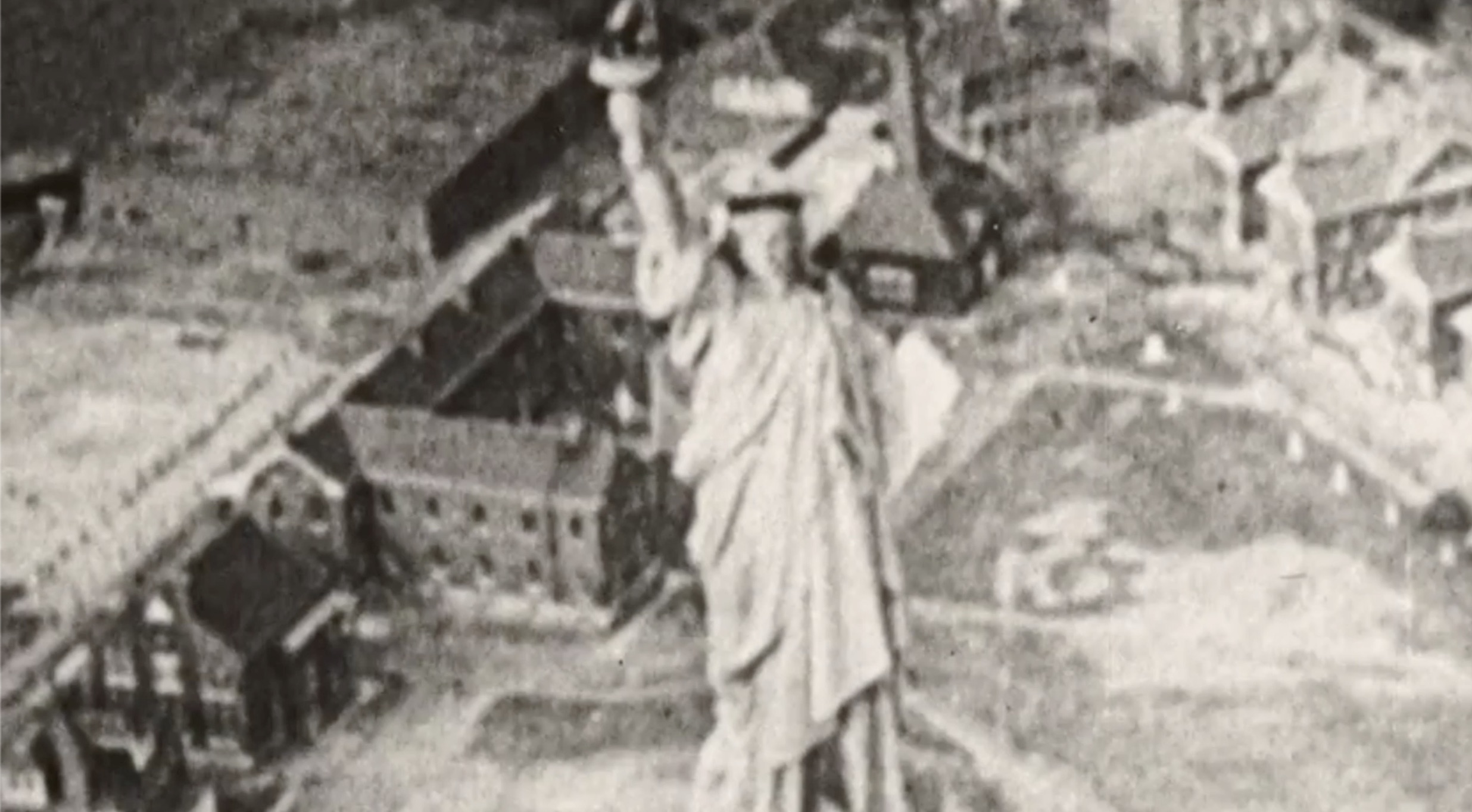
Rewatching Sex and the City as an adult, I found myself increasingly drawn to the B-roll, the city itself as a kind of silent protagonist. The show famously refers to New York as the “fifth character,” but I became curious about what the city looked like when isolated from the central narrative. I wanted to observe how the city itself moved through this narrative timeline that paralleled the current state of America at the time. What struck me most was how New York’s presence subtly transformed after 9/11. The opening credits originally featured the Twin Towers prominently, but following the attacks, they were quietly edited out. Even the B-roll of the city changed quite a bit.
_Ref-0030-SC.128.jpeg)
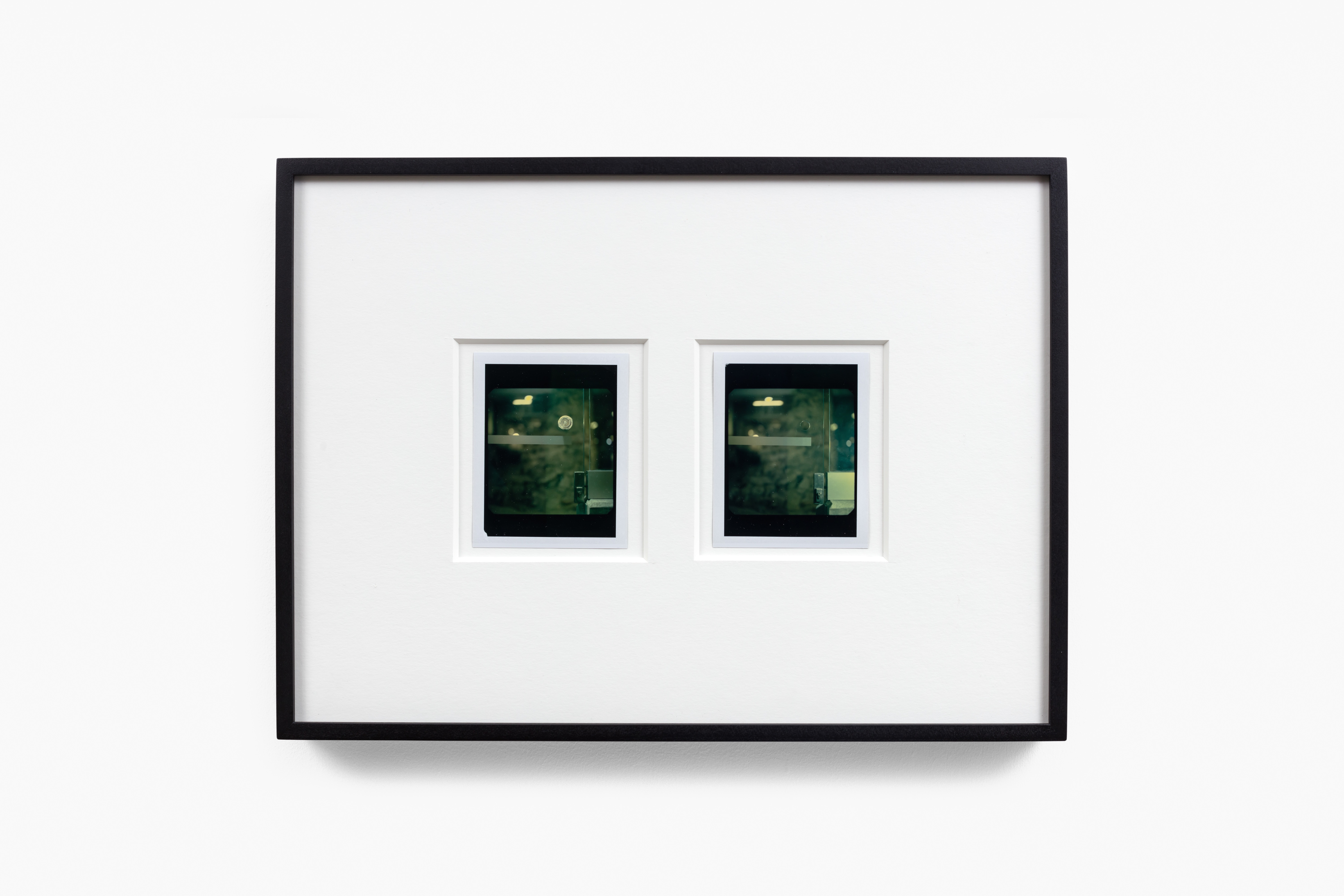
Well, they sort of did one episode as a tribute: “I Heart NY” [Season 5, Episode 3]. At the end, they dedicated it “to all the people in New York,” which really stood out to me. There’s a scene in that episode where summer transitions into fall outside the Guggenheim. The leaves fall gently from a tree, and it feels symbolic in a melancholic, vulnerable, and poignant way. That moment became an important visual marker in my video, representing the shift between pre- and post-9/11. I zoomed in to isolate the falling leaves, letting them quietly mark that transition, while that was also the marker for the score I had made with Luca Mantero to change its tone.
Pop Inflection came about in a quite simple way. I was drawn to the word “inflection” because it refers to different pitches and tones, which I felt described the works in the show well. I saw pitch and tone almost like a “copy and paste” or “stitch and sew” – both methods I used in making the work for Pop Inflection. I included “pop” because I wanted to reference bringing pop culture into the conversation, especially through the video, and having that sort of narrative at play throughout the exhibition.
Pop culture and architecture are really at the frontline of how we experience the city. They shape not just how places look, but how we move through them, what we expect from them, and how we remember them. In Pop Inflection, I wanted to pull that apart, to look at how cities are built emotionally, visually, and socially. The show is presented in three parts: video, sculpture, and wall hangings, each acting like a scene in a larger performance. Together, they explore ideas around repetition, nostalgia, labour, and the way pop imagery and design language quietly influence our sense of place. It’s about the city as something felt, edited, and constructed over time.
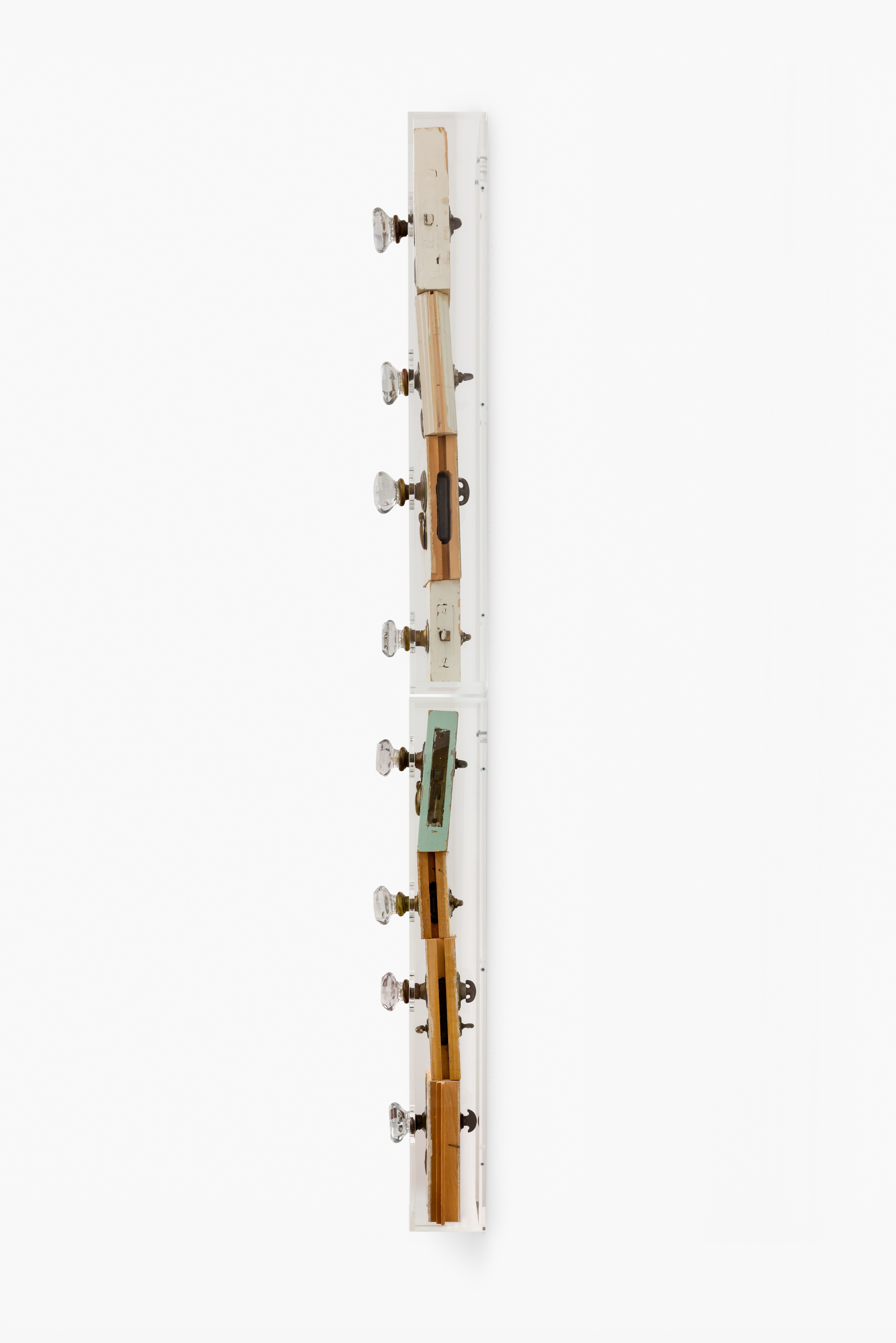
Colour is something I find rather than apply. It’s often already embedded in the material in its history and its wear. Even the more saturated colours I use are rooted in context, pulled from place, memory, or the built environment. Something that felt really special while working with colour was the paint chips on the door handle in Lot 2454 / Lot 5152 (2024–2025). You could see glimpses of how many coats of paint had built up on that door, little scratches revealing rainbow-like swirls underneath. It was nice to notice those flashes of colour beneath all the beige layers.
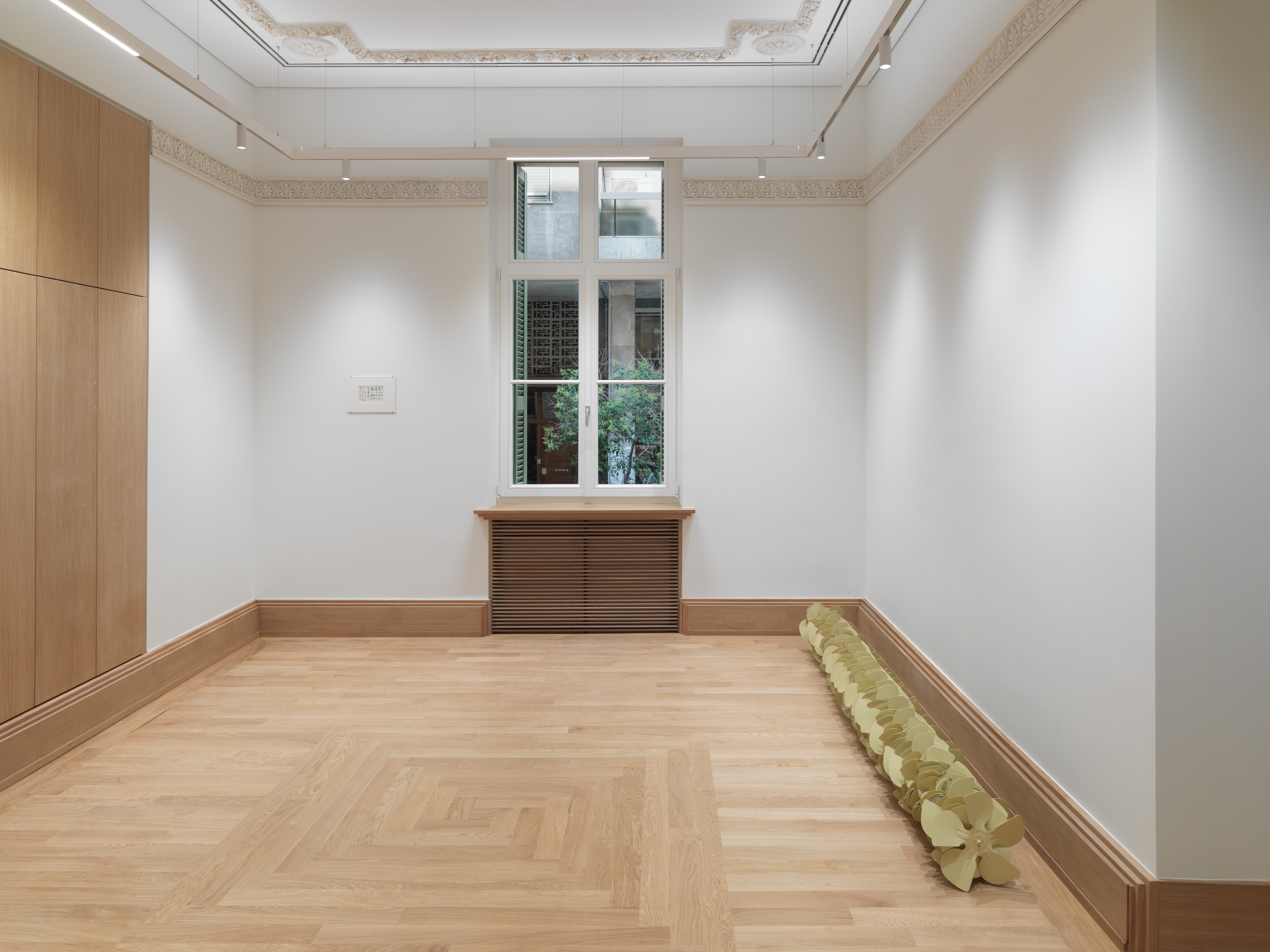
I first discovered the fans in a junkyard in Wales. They were parts of an old industrial cooling engine, stained with oil and grease, scratched and worn from years of repetitive use. The signs of labour and wear gave them a strong physical presence, as if they carried the memory of the machines they once belonged to. It was one of those rare and satisfying moments in the studio when you bring something back and instantly feel a connection. I didn’t alter the first piece too much; I simply compressed the fans into a line and threaded a red transformer wire, salvaged from an electric doorbell through the middle, attaching them to a stud bar.
The way the fan blades locked into each other reminded me of a desert rose: a natural formation that occurs when minerals crystallise in dry, sandy environments. Over time, the crystals grow and trap sand between them, forming rose-like shapes. This summer, I created a much larger version and had it powder-coated in a yellowish beige. I wanted to give it a colour that felt more domestic, rather than maintaining its usual heavy industrial appearance. I liked the idea of it camouflaging into a gallery setting like defensive civic structures that try to blend into the architecture they’re attached to.
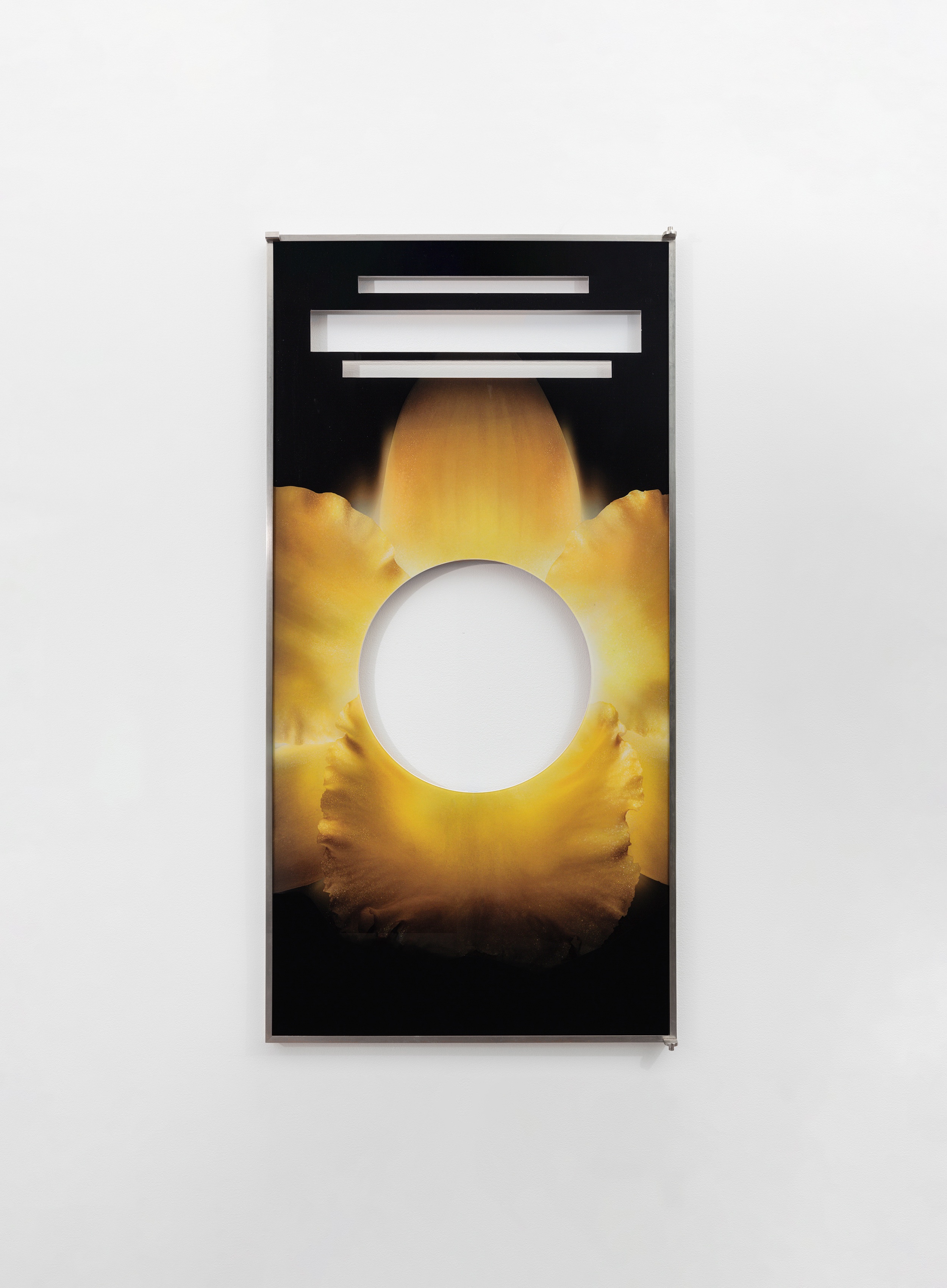
When the Waldorf Astoria in NYC held its historic auction, I bought a framed perfume ad from the spa. Its background was an orchid, a flower tied to luxury and a sense of timelessness. In cities, flowers are especially interesting. They’re fleeting, yet we surround them with symbolism about eternity. They don’t grow wild, they’re curated, bought, and displayed. They hint at nature, but also at desire, memory, and escape. I cut out the text, punctured the glass and backing, so the wall behind becomes visible. It turns the fantasy back on itself; the idealised image gives way to whatever real surface it’s placed against.
100 percent. When I use found or discarded materials, there’s always a sense of absence attached to them. The voids in these objects often point to missing history or overlooked details, things that were once part of a system but have been forgotten or left out. I’m interested in how these gaps can say just as much as what is physically there. I always think of John Cage’s composition 4’33”, how the silence in that piece isn’t empty, but instead makes you hyper aware of everything around it.
It really depends on the project I’m working on. Right now, I’m deep into a process involving a lot of slide photos, so most of my time is spent organising and scanning them into my computer. It’s a bit methodical, but I find it meditative. Even when I’m not physically working on something, I still try to show up most days. Sometimes I just do research, reflect, or sit with the work (and occasionally stare at the ceiling, drinking lots of coffee).